
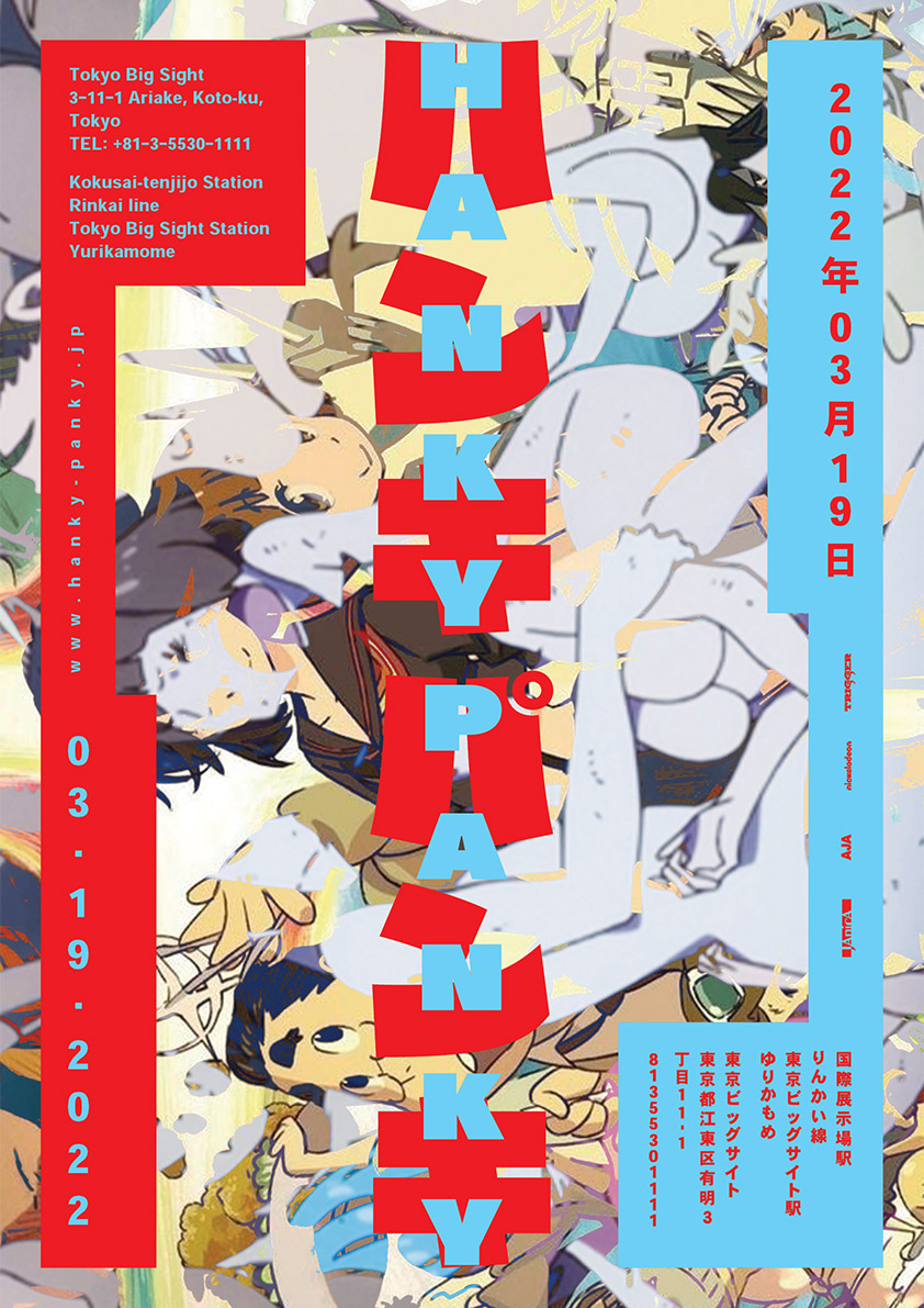
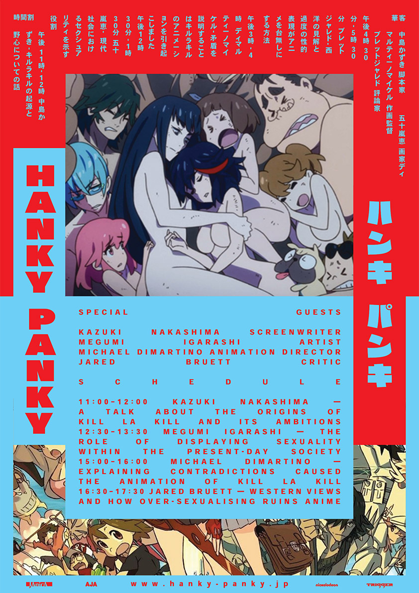

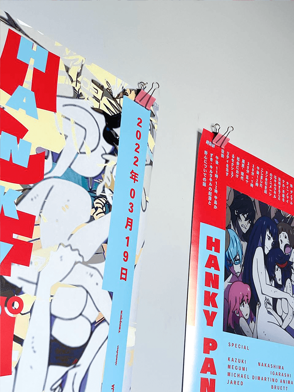


Hanky-Panky is a thought-up conference about oversexualization of female anime characters.
I created all of the tiny details, such as the main theme for the 2022 conference, location, speakers and topics they will be discussing, etc.
The main purpose, though, was not to make
a fantasy world, but create a fitting visual
language for it through a tedious research
and development process.
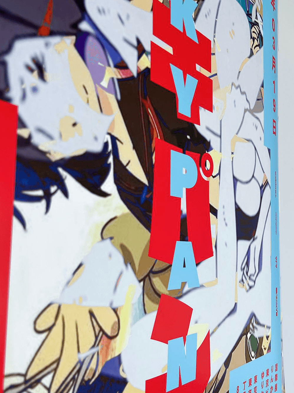
As the main theme of this year’s conference
is the anime called Kill la Kill, a lot of visual
elements were taken from it to form the design.
The Raglan-Punch typeface, which is always stretched to fit the frame in the series,
and the main contrasting colors, signifying
the opposition of two sides.


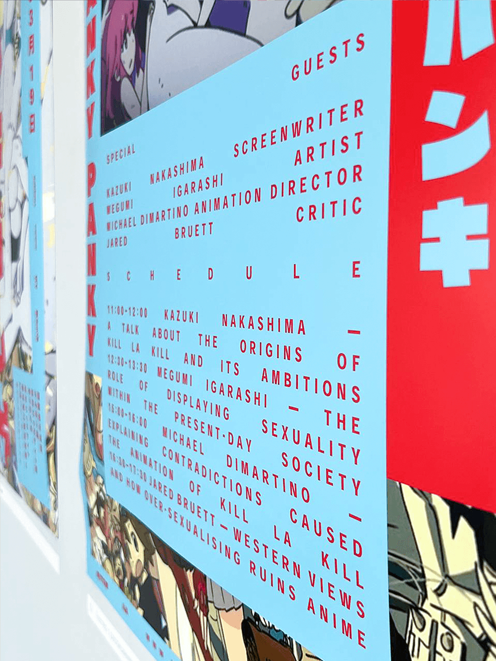
Kill la Kill is an anime, which was supposed to be something sexually empowering, but the camera-
work and female character design made it to be
the opposite in the eyes of the masses. There
are many opinions about this topic, and the 2022
Hanky-Panky is supposed to be an event, dedicated to presenting these opinions to the wider audience and letting the western creators and critics have
a chance to state their position, as well as, listen
to what the authors of Kill la Kill and other represen-
tatives of Japanese culture have to say.
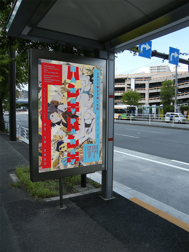
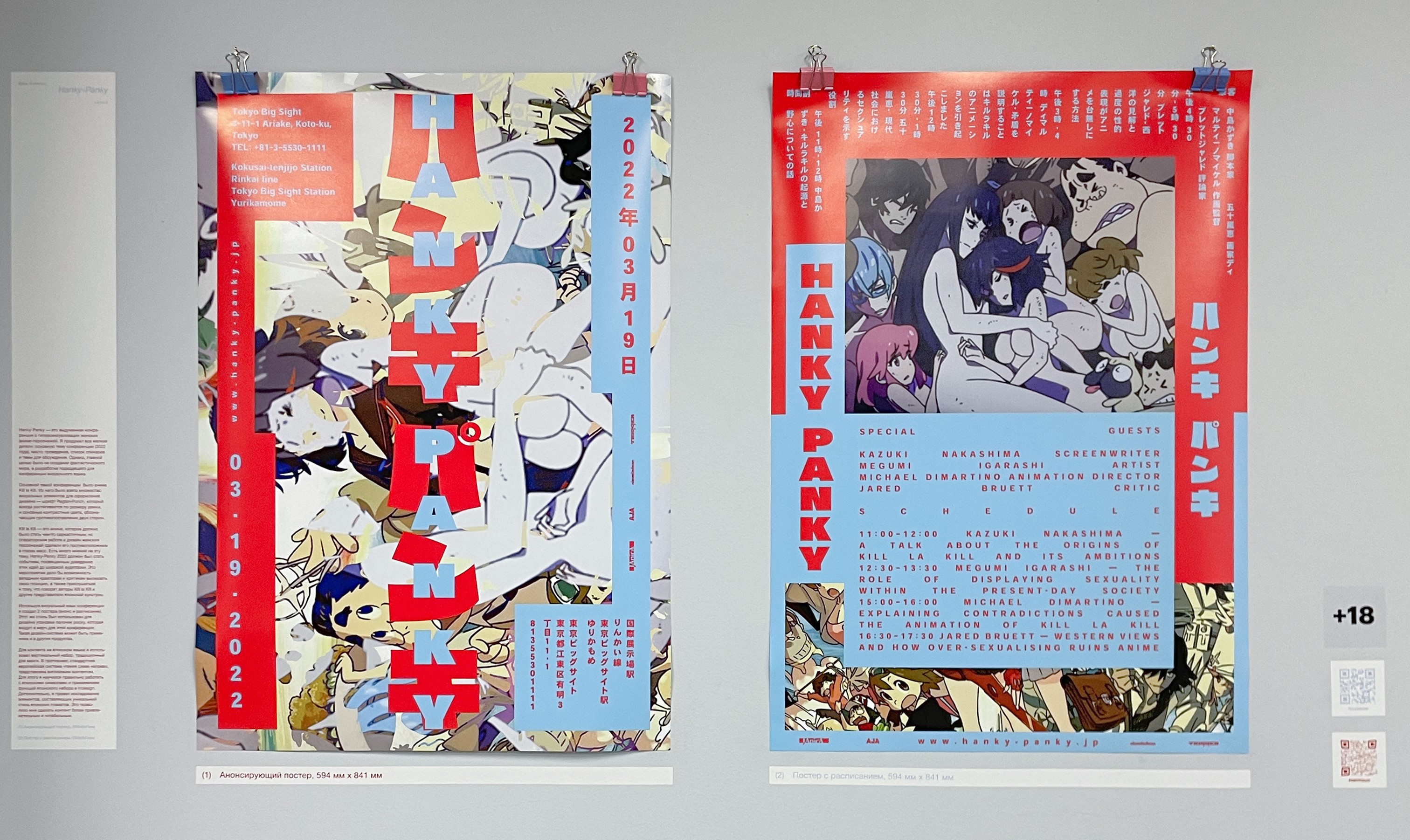
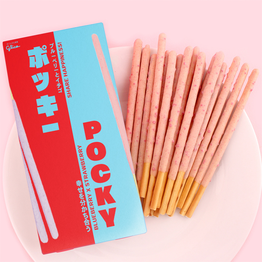
With the use of my visual language, I created the announcement and schedule posters. I also employed it for the pocky packaging, which is the merch item for this conference. The design system is applicable to a multitude of things.
The process of creating the visual language
involved a lot of research. For the Japanese con-
tent I used vertical typesetting, traditional to manga,
while the English half is set horizontally, left to right. For the sake of doing that, I had to learn how to do this right, both in terms of treating the content and using the Japanese typesetting functionality in Indesign. I also conducted research on the use
of frames in Japanese poster, which makes the placement of content more engaging and readable.

This mockumentary is a group project.
The main point of the brief was to make
a documentary about a record cover, which was fully designed by us. The band, album and all of the context, surrounding it was completely thought up by all the group members collectively. The only thing, which
is real, is the music genre — "Son Montuno".
I, personally, actively participated in all
stages of the process, from the choice
of genre and the initial brainstorm,
all the way through to the montage.

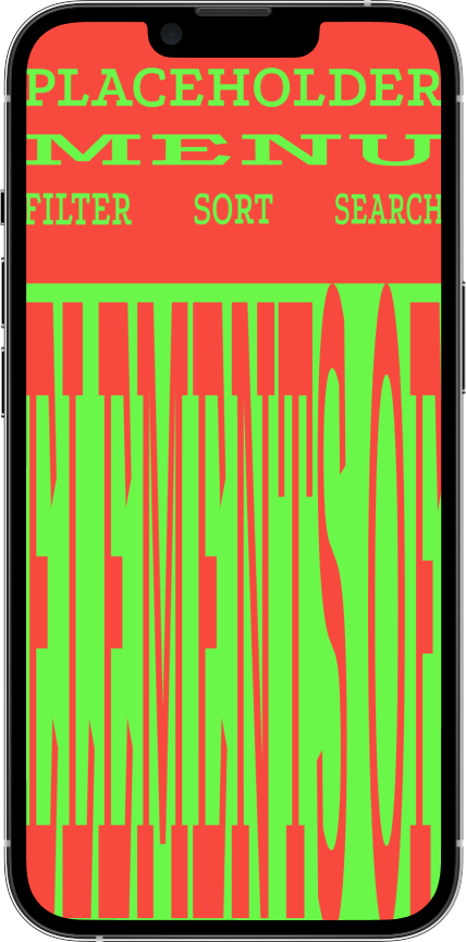
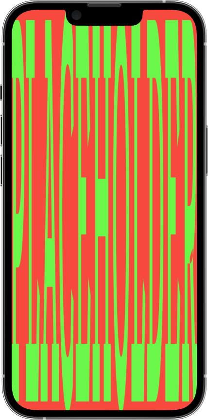

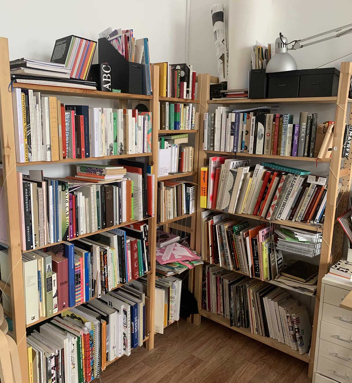
Placeholder is a small library in the centre of Moscow. It is a place aimed primarily at creative professionals and students, who mainly come there to look at good design of either the books themselves or the content contained in them. The problem was that it didn't have a proper system to surf through the slowly increasing assortment of books.
I created a catalogue prototype for this library. I took a very playful approach to the design, which is quite atypical for a library, but fitting for this particular case, because once again: the library is for creatives.
The basis of my design system is to use the number of pages as a height for each entry in the catalogue, and also every image in the album page. All of the text is typeset systematically for the lines to take up all of the space in each section. The number of lines also depends on the amount of characters in a book’s name. Everything looks like a rotated bookshelf, and the stretched out type creates a sense of this shelf being full to the brim. This correlates very well with the Placeholder, as a very small amount of space is filled up with almost too many books.

This is a video-clip for a part of a music track “Sinister shadow of a Zeppelin” by the band
“Abyss of Anal Oppression”. I illustrated the gore contents of this hardcore rock song, but enacted
it in a humorous manner, so the video is quite
a funny interpretation of the track.
In the video, only the chorus of the song is being used with my own beginning and the end. I made
it so that the pace of the clip changes, making it
a more engaging piece. It flows from a slow start, speeds up, once the track begins, and then comes
to a surprisingly calm finish.


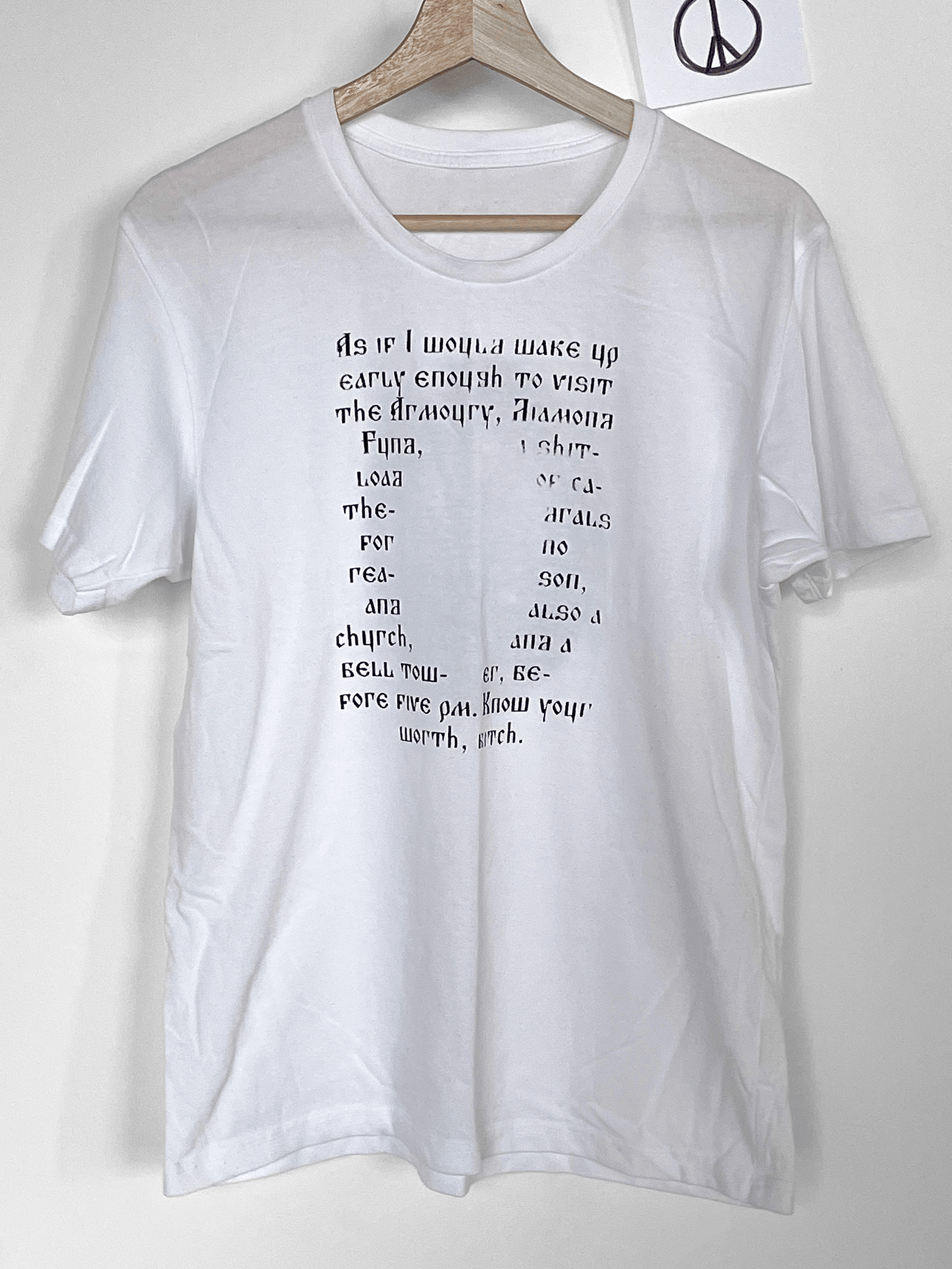

The project is a sarcastic take on how
the content of Moscow Kremlin Museums
is organised and presented there. A multi-
tude of things are included in this organi-
sation, but the main themes are Russian Empire, Soviet Union, and Orthodox Christianity. This t-shirt design illustrates
all of these combined.
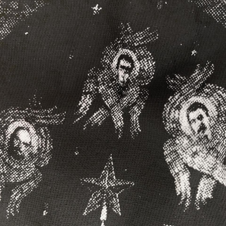
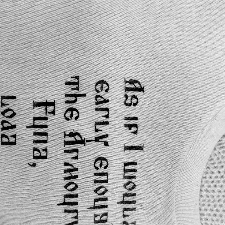
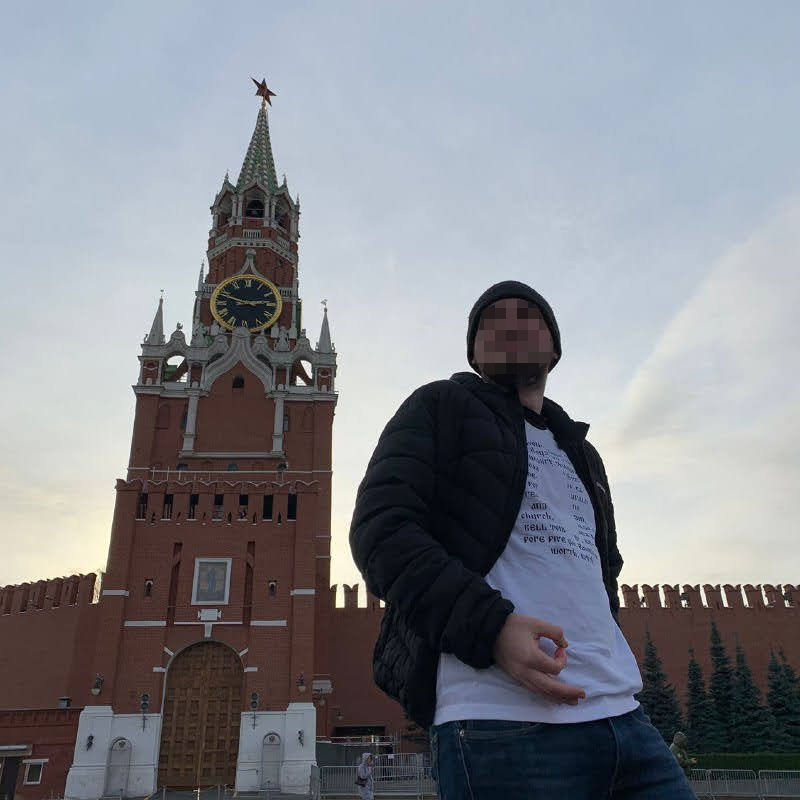
I designed it in such a way, that there’s
an interplay of both front and back.
The typographic front part encircles
the imagery on the back, describing the feelings of schoolkids, who are dragged there for excursions. Such placement
shows the image of Moscow Kremlin Museums, created with the opinions
and experiences of its visitors.