

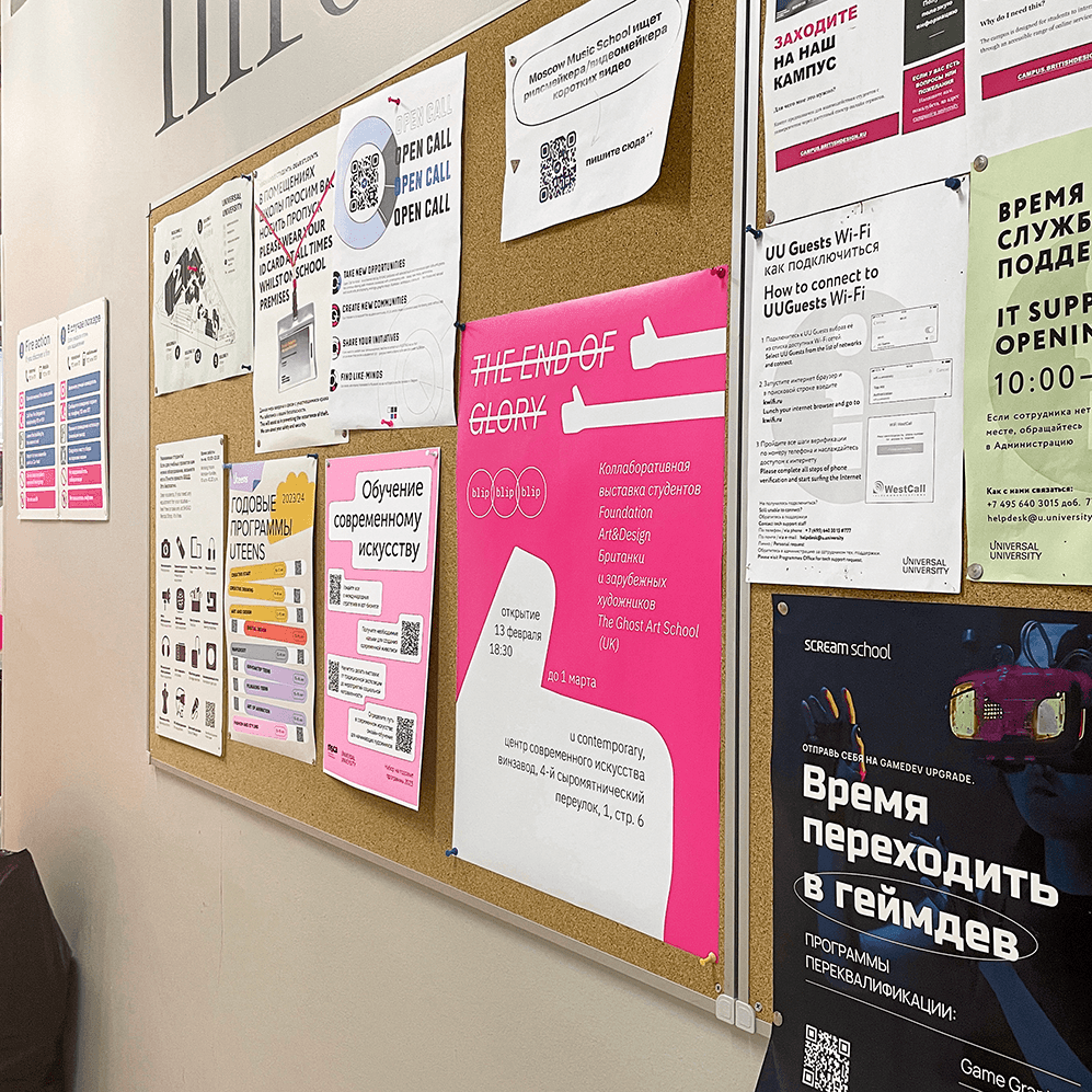

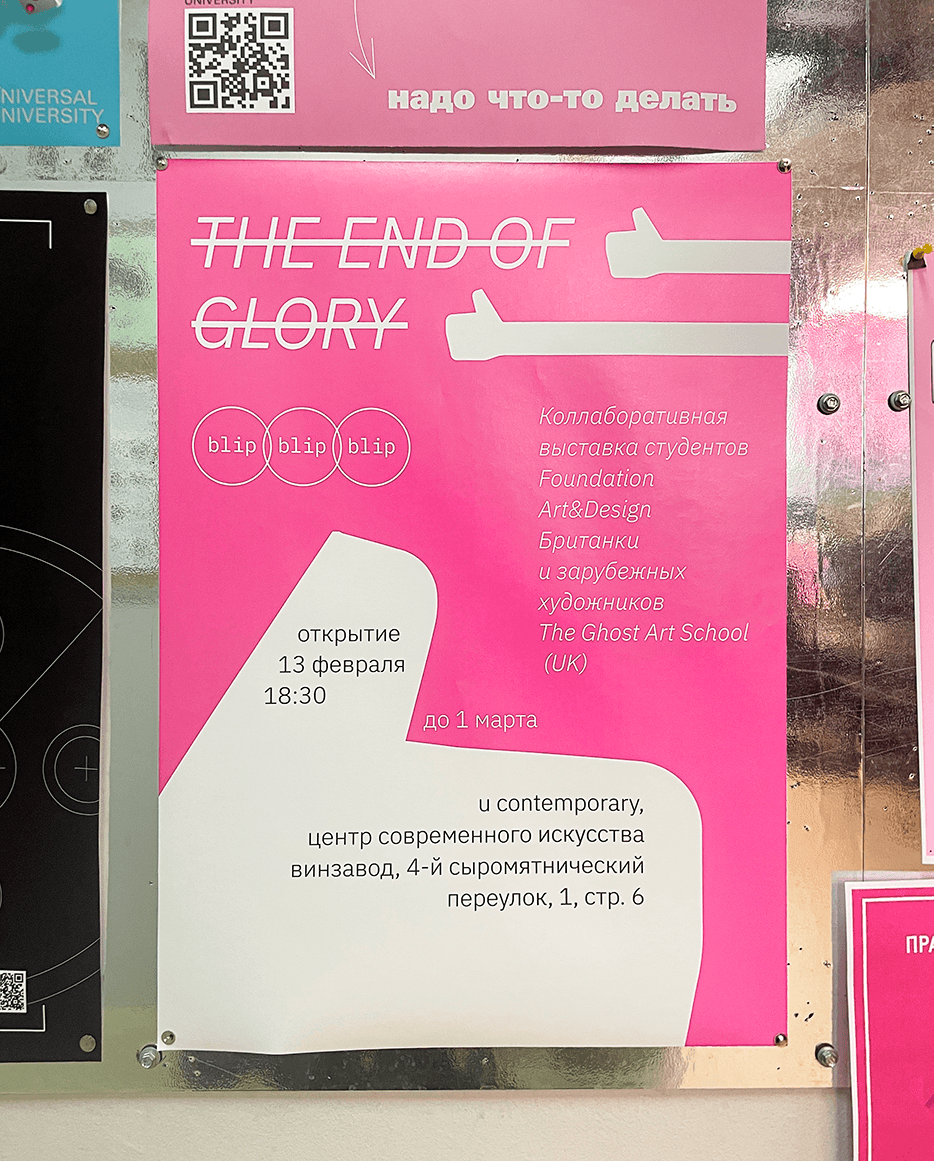
"The End of Glory" was an exhibition on Winzavod in Moscow, curated by the head of the Ghost Art School from Glasgow, UK, Rory Macbeth. The main idea behind the exhibition was a no-word communication between the British artists
and the students (both current and graduated)
of the British Higher School of Art & Design.
While the British artists made the works to be exhibited, the Russians were to make the other
half of the exhibition, by choosing ways in which
to interpret and present the said works.
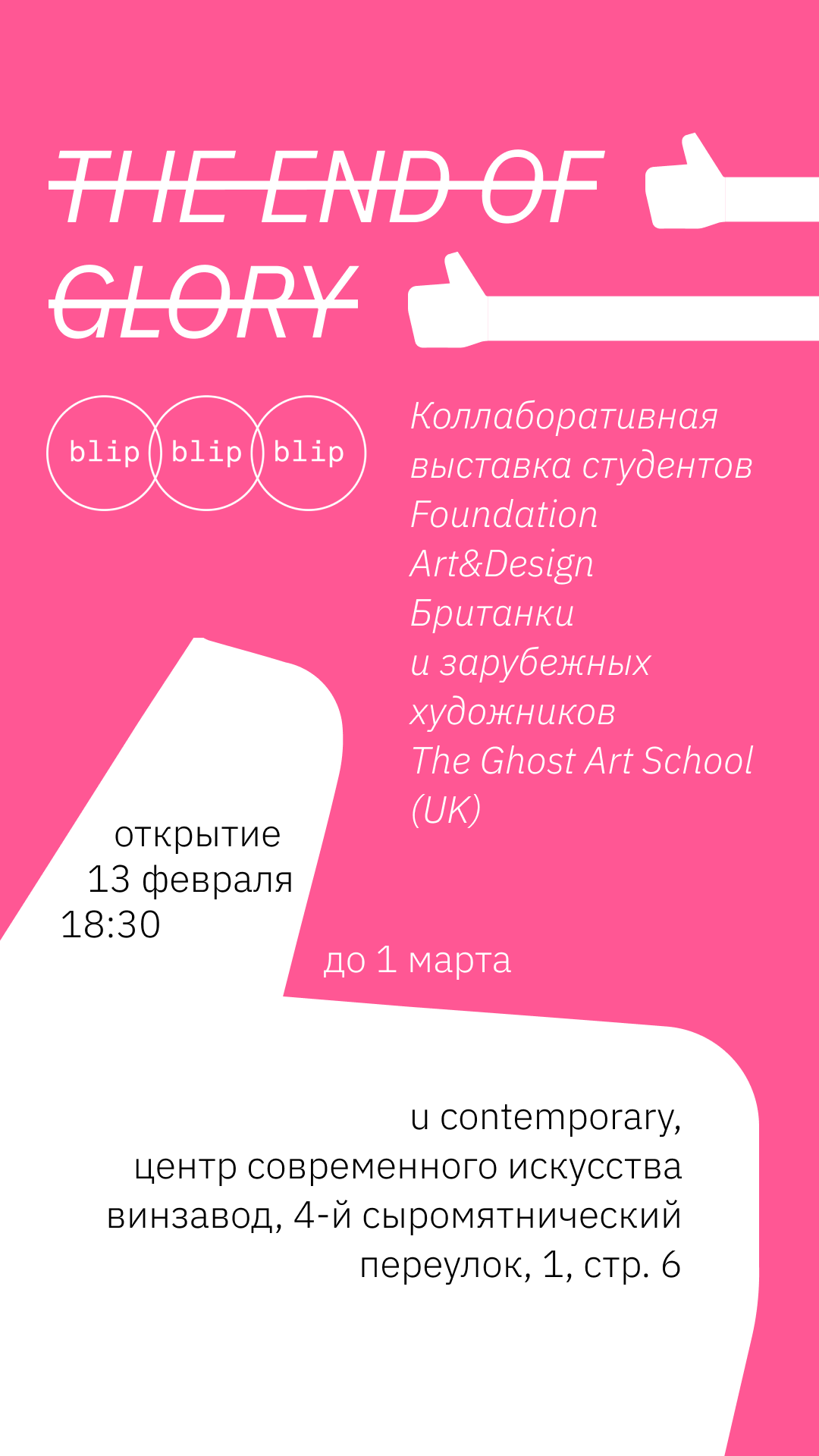

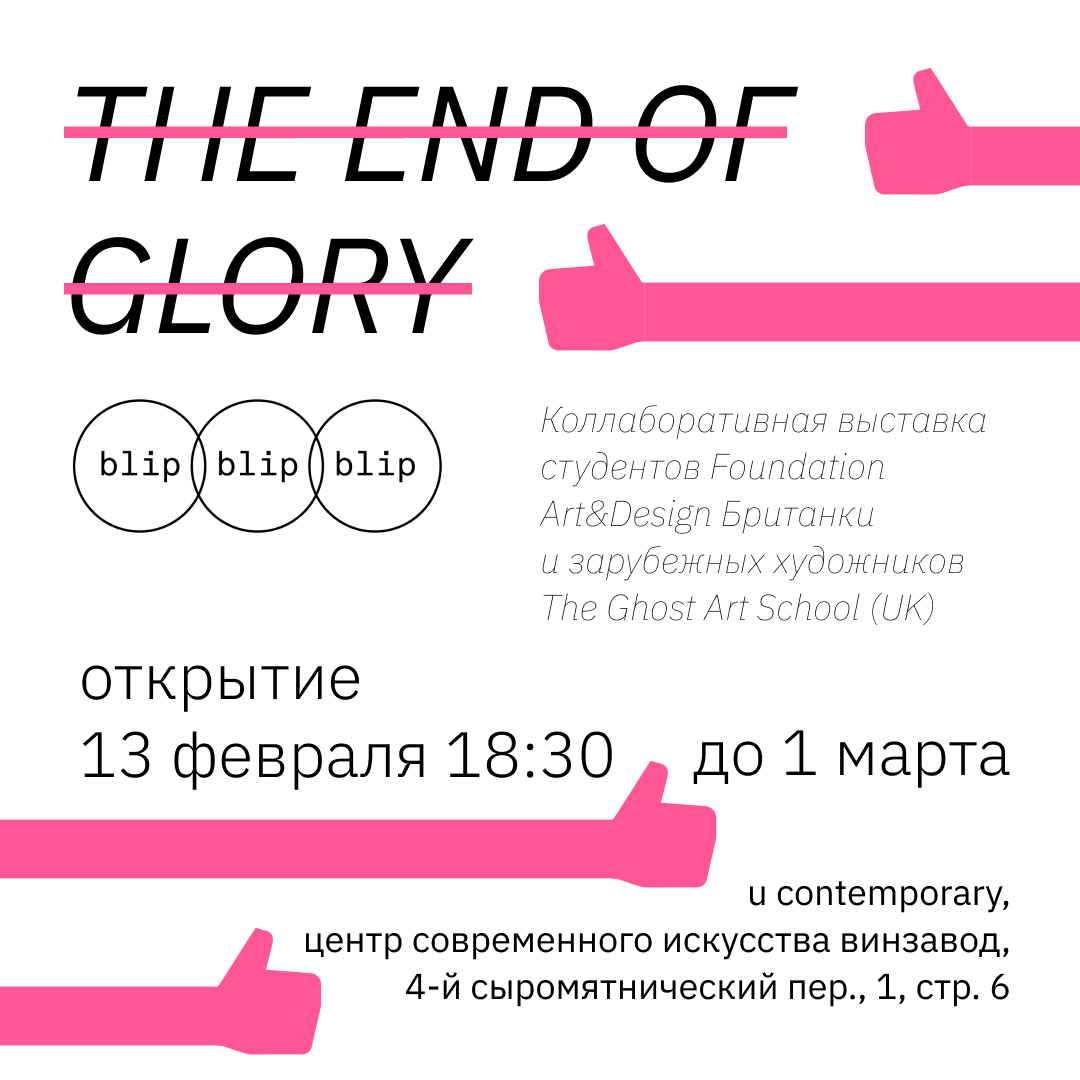
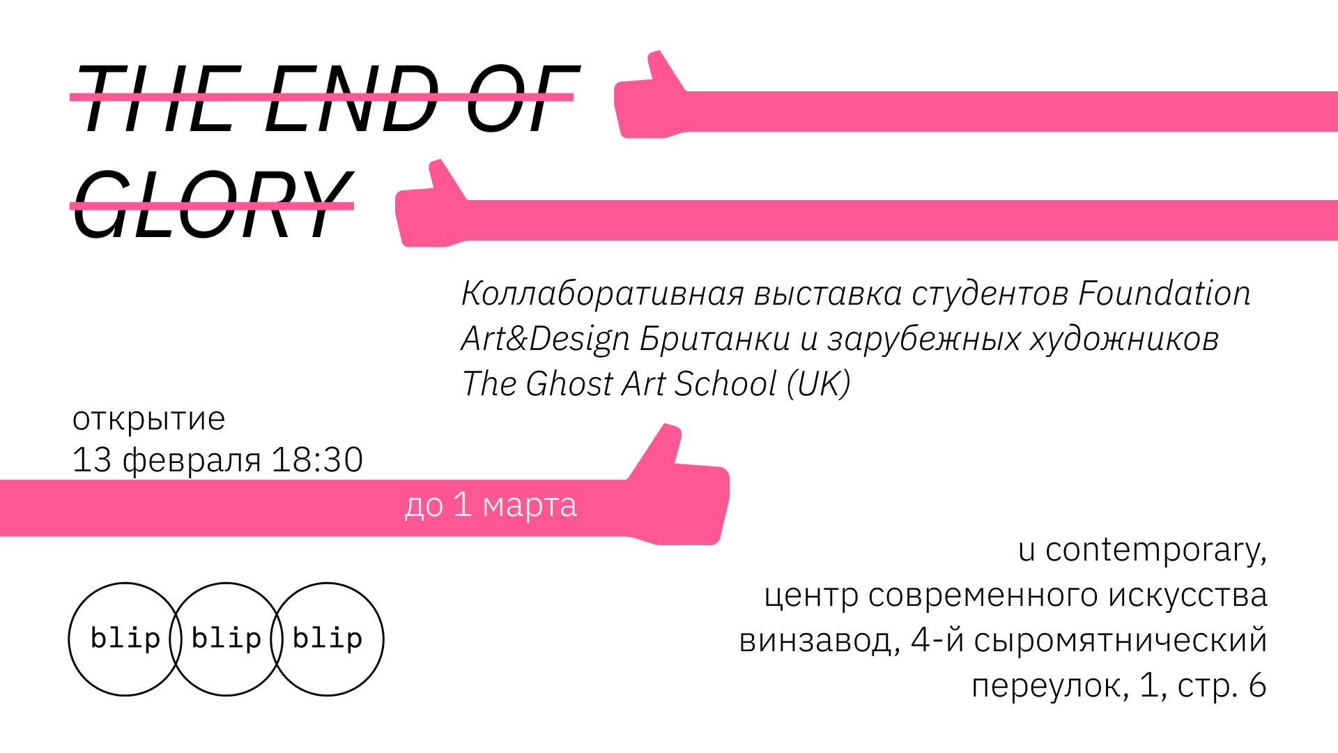
I made the design for the announcement of the exhibition. This included the images for social networks and the website of Universal University, as well as the poster.
The choice of colors and the main symbol,
the thumbs up, came from one of the works.
It was the most eye-catching and colorful element in the exhibition space and a sort of a navigation
at the same time.


This was a very short project. The task
was to create an isometric room in Blender. All objects inside the room were also supposed to be custom-made.
I had a lot of freedom in choosing the
general theme and the objects themselves,
so I went for a typical Soviet appartment vibe. I recreated the utmost necessary objects, as well as set lighting in a particu-
lar way and worked on PBR texturing,
to make it actually feel wholesome.


Steeltek is a company, which helps factories and various production companies to automatize their production. Essentially, they supply heavy duty robots and work on their implementation.
As it's a newly founded company, they needed a visual identity and also catalogs and commercial offers for their clientele. I designed a logotype, chose a color scheme and the typeface to be used in all their future communication.
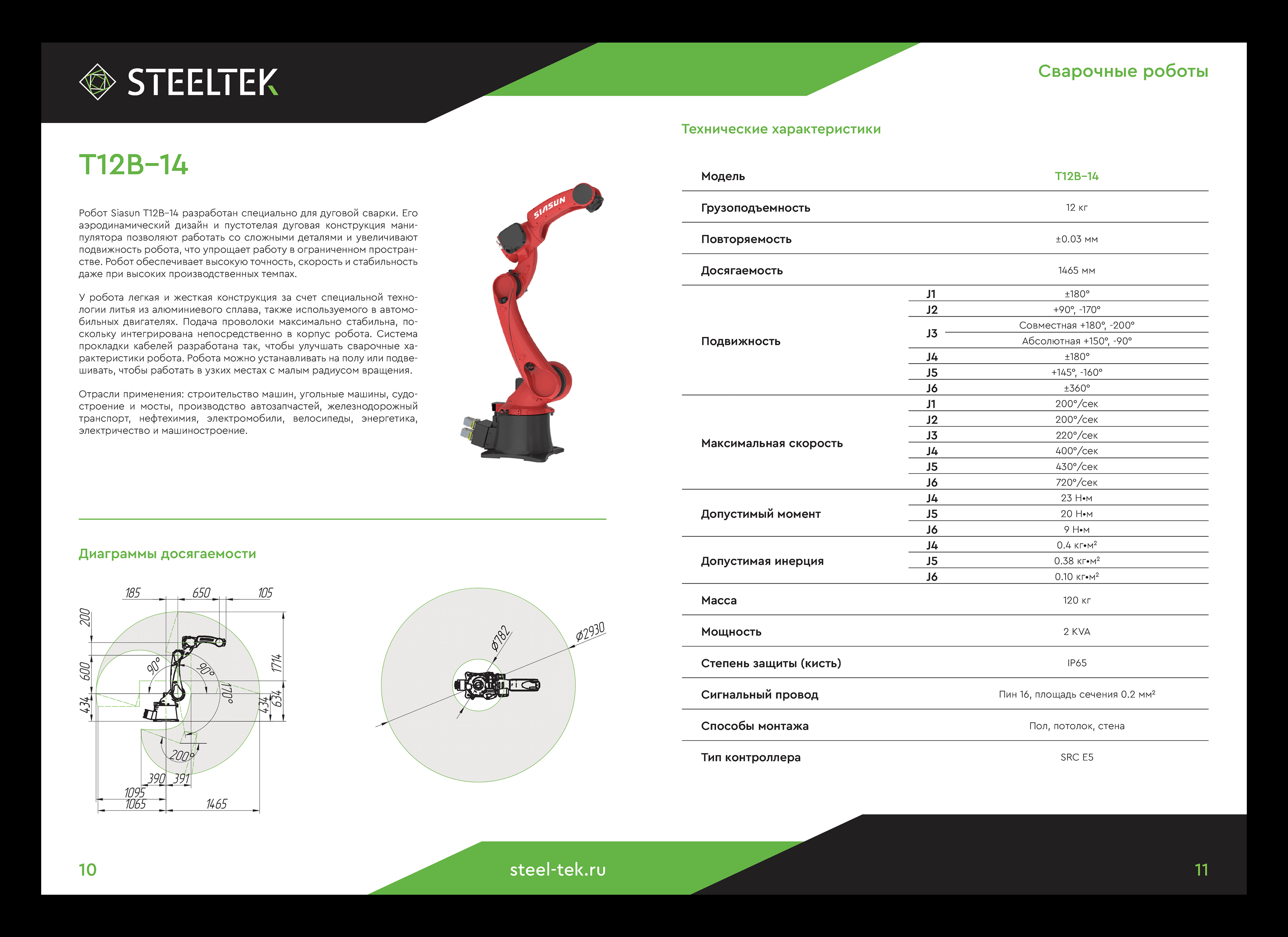

The main part of the project was the creation of two catalogs and a commercial offer. It was necessary to include a lot of technical information and tables and make sure that the spreads aren't overloaded with content, which is a very common problem for such companies.
The graphic elements, such as headers and footers, stem from the logo design. Using the same logic and angles for those resulted in the overall consistency and uniqeness of the brand.


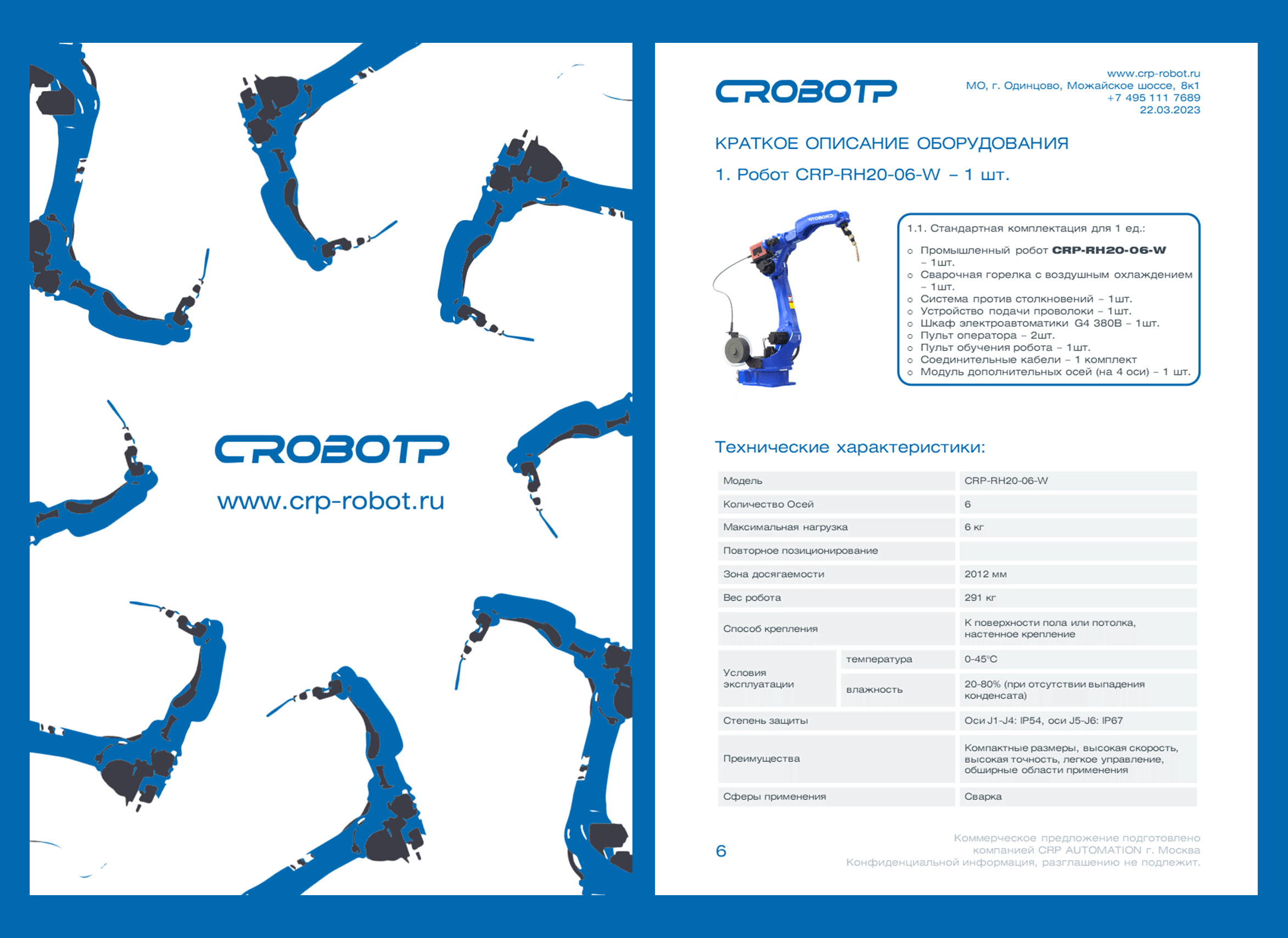
This is a redesign of CRP commercial offer. The task was to make something, that was essentially just a regular document, into
a far more readable and genuinely better looking thing.
The design was supposed to be made
in Powerpoint, which made it much harder
to deal with grids and typesetting. Also,
the commercial offer had a large ammount
of technical information almost on every
page. Therefore, fitting everything onto the same page, while not loosing readabilty,
was challenging. All of these hurdles, though, were successfully surpassed.